Industry
Rewards & Recognition SaaS
Average Revenue
$42M
Total Clients
2,000+
Total Users
2.5 million+
Compass Mobile App - Redesign
This project is to redesign the sales engagement platform for consistency, improve motivation, user engagement and to improve the user performance through gamified performance tracking.
Compass - Mobile App Redesign
Project Overview
The app is used by sales teams so they can track KPIs, monitor incentives, benchmark performance against peers, also earn rewards. While the existing version functioned necessarily, the user interface was visually inconsistent, navigated unintuitively, and did not motivate users toward basic usage.
Client Requirement
The existing internal sales engagement app will get a redesign once “Flame”, their in-house design system, is adopted so user engagement will improve via gamification, a more modern UI, plus better interactivity.
Objectives
Use Flames Design System adoption for ecosystem consistency.
To engage users, to retain them, and to provide clarity, modernize the UI.
Leaderboards, badges, and rewards are gamification elements.
Achieve a reduction in visual clutter via improvement of information hierarchy.
Design dashboards that can be motivating and can remain data-heavy and accessible.
Solutions
Design Process
1
Discover
2
Research
3
Analyze
4
Design
5
Test
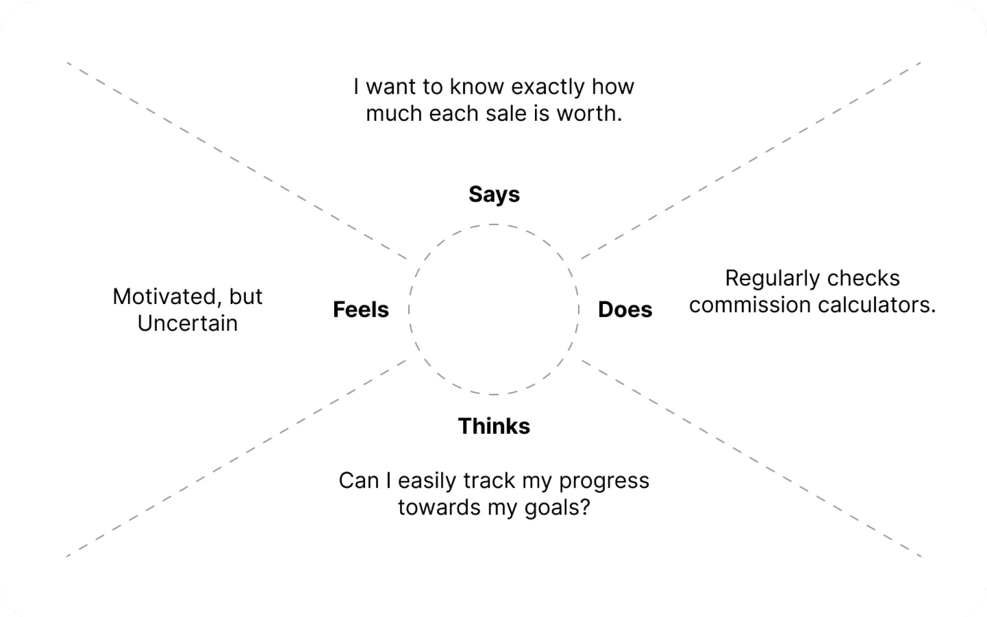
Users
User Personas
Name: Priya Mehra
Age/Gender: 29 / Female
Occupation: Inside Sales Executive at a Fintech SaaS Company
Location: Bengaluru, India
Tech Savviness: High – Confident using mobile apps, dashboards, and productivity tools
🎯
GOALS
Stay motivated through visual progress tracking and rewards
Easily access earning history and forecast without extra effort
Feel engaged with game-like interactions and leaderboard visibility
Receive timely feedback to improve performance and course-correct quickly
😩
CHALLENGES
Difficulty understanding complex incentive programs with multiple KPIs
Frequently checks with managers to confirm earnings or performance status
Demotivated by lack of real-time feedback and visual progress indicators
Gets overwhelmed by dense data presented in text-heavy formats
👇
NEEDS
A clear and modern interface to track tasks, earnings, and goals
Real-time updates on performance compared to peers
Fun, rewarding elements like badges, scratch cards, and streaks
Guidance through feedback prompts or tips during slow performance phases
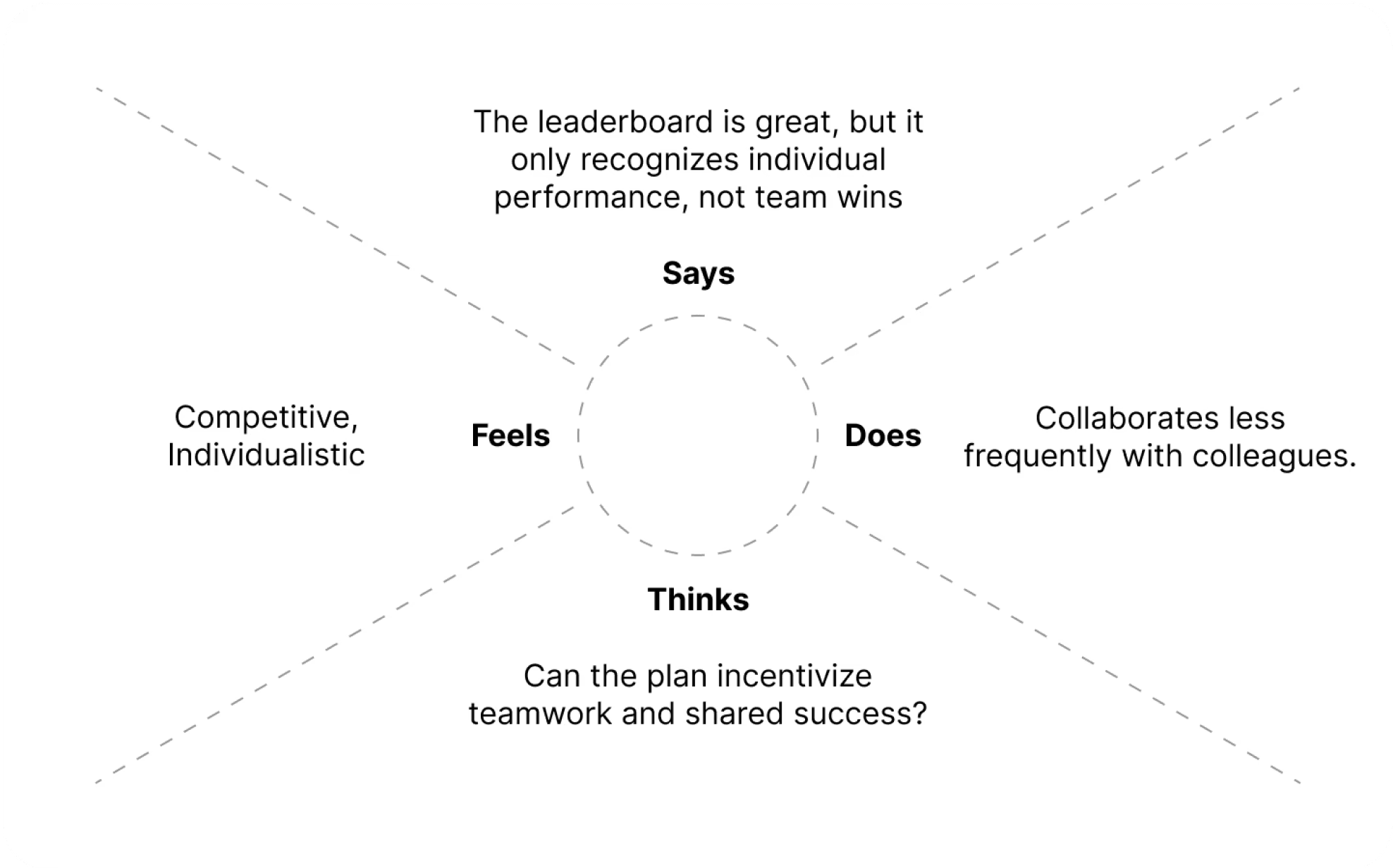
Name: Arvind Sharma
Age/Gender: 42 / Male
Occupation: Regional Sales Manager at a Consumer Tech Company
Location: Bengaluru, India
Tech Savviness: Moderate – Comfortable with smartphones
🎯
GOALS
Track team performance with clarity and without switching tools
Motivate team using rewards, recognition, and performance insights
Save time by accessing summary views of KPIs, earnings, and goals
😩
CHALLENGES
Managing multiple team members’ performance and incentive progress
Difficulty identifying underperforming reps quickly from raw data
Too many manual follow-ups and unclear visibility into team-level targets
👇
NEEDS
A centralized dashboard with sortable, filterable team data
Visual cues for performance health, upcoming deadlines, and earning gaps
Feedback module to share suggestions or push nudges
Easy access to incentive breakdowns to answer team queries faster
Empathy Map
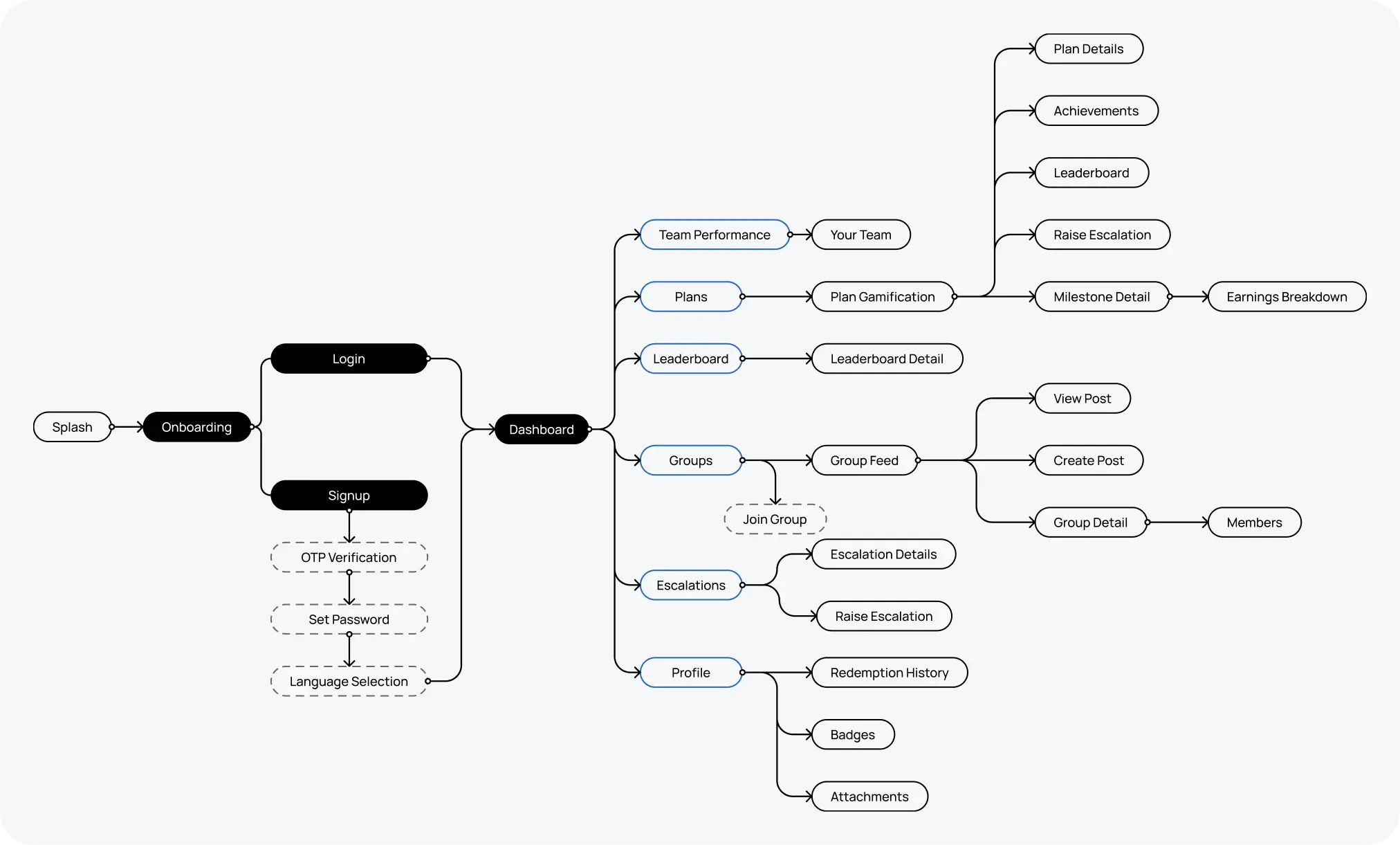
Information Architecture
Key Enhancements
Unified Visual Language

Improved Dashboard Readability
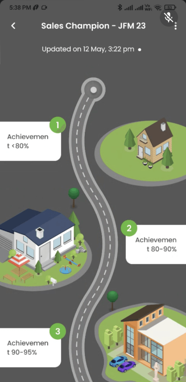
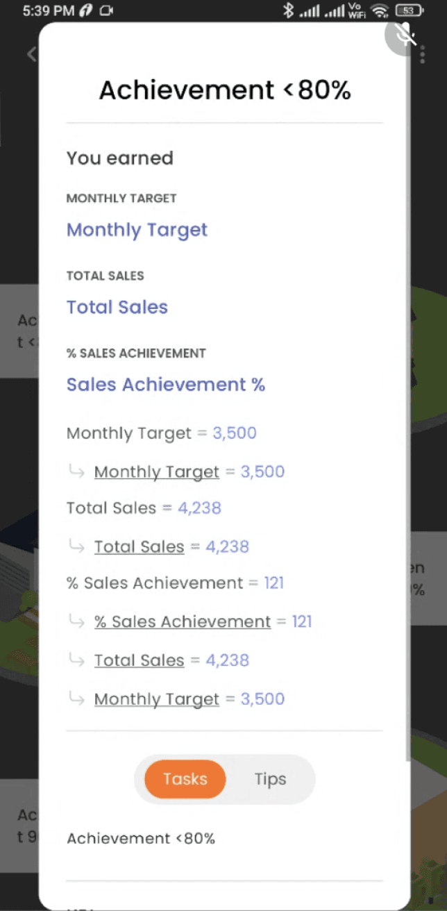
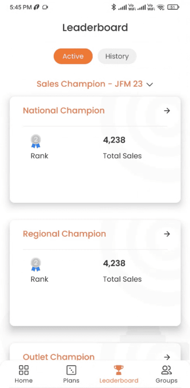
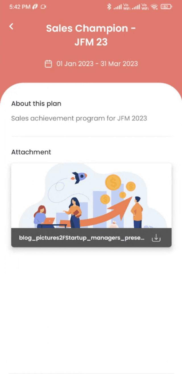
Dashboard Wireframe
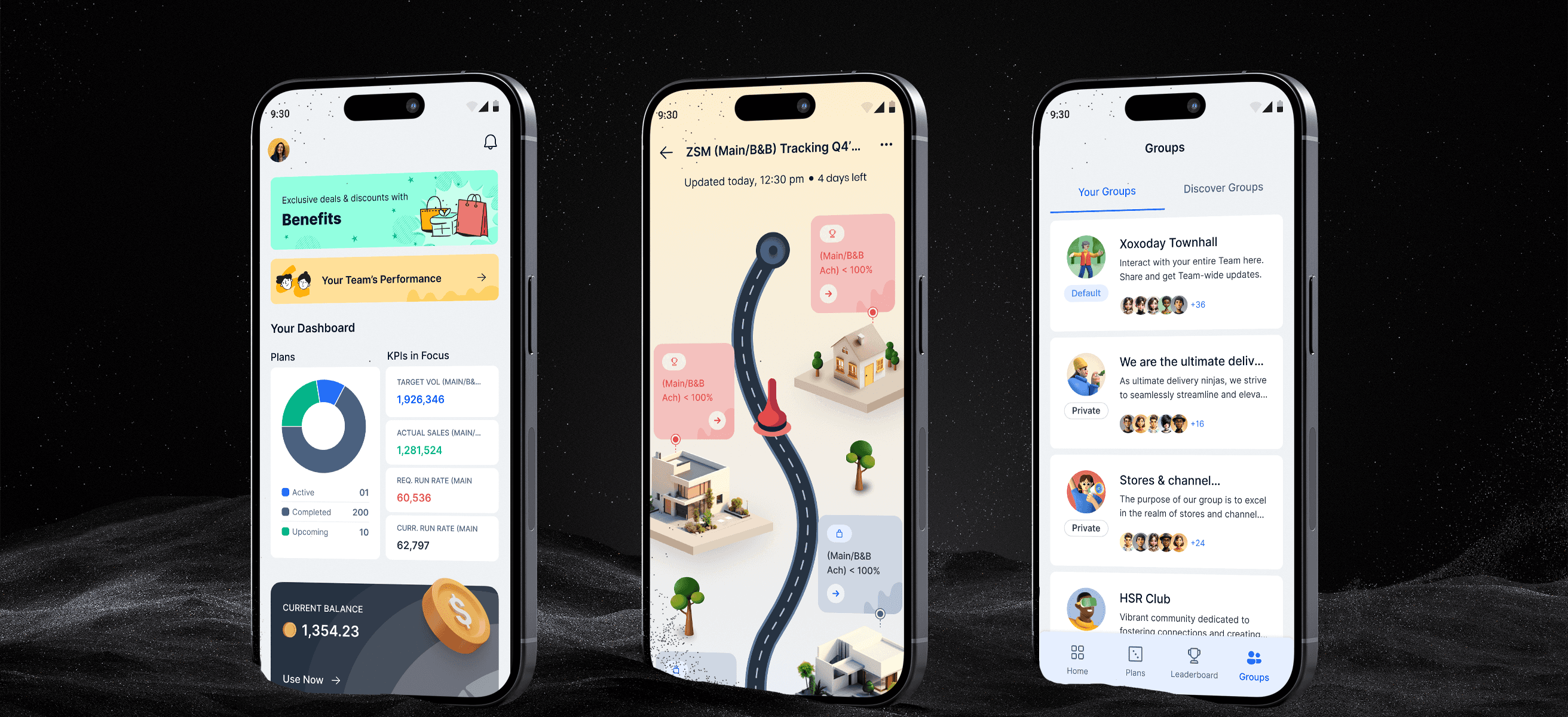
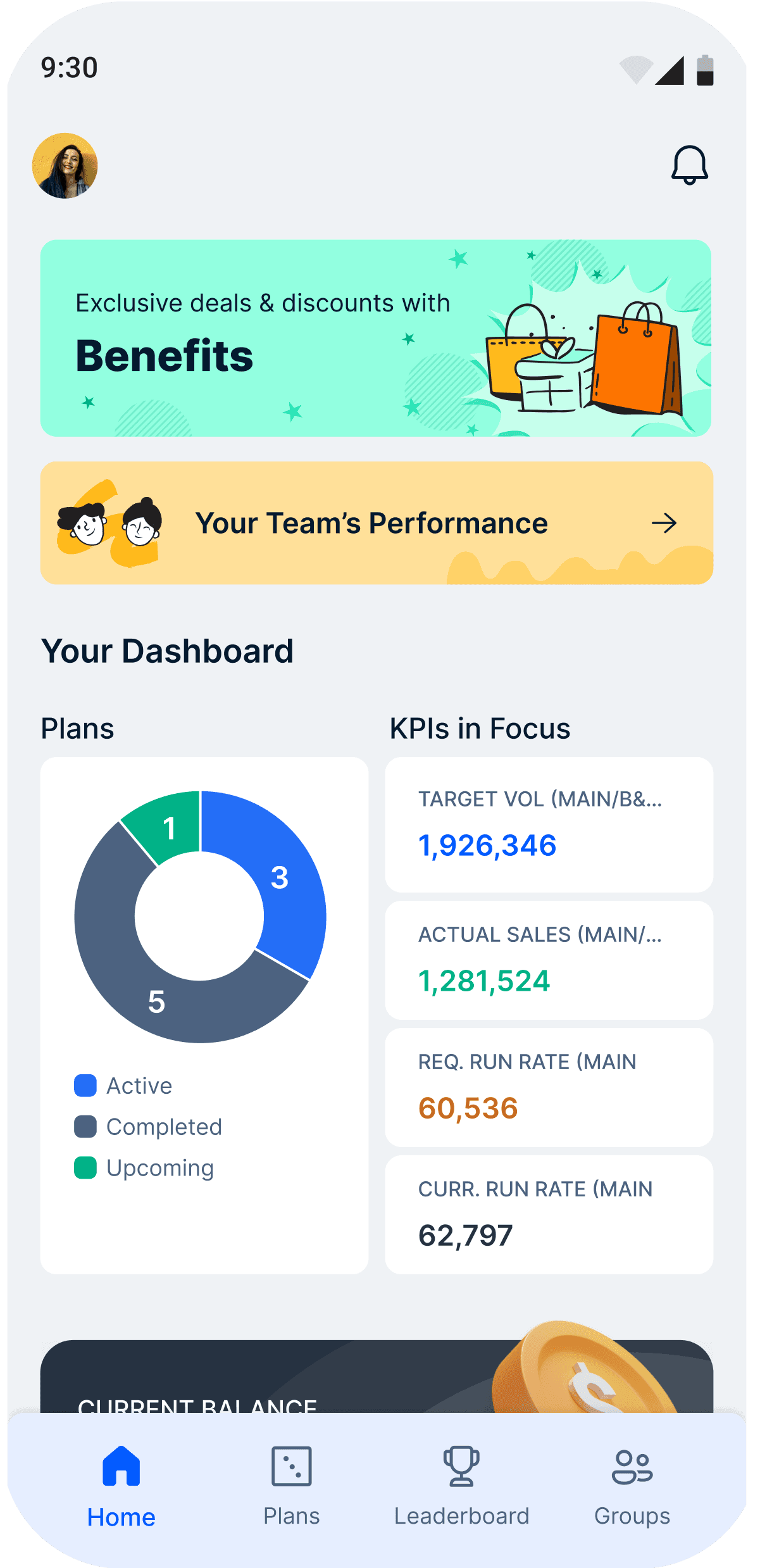
Dashboard UI
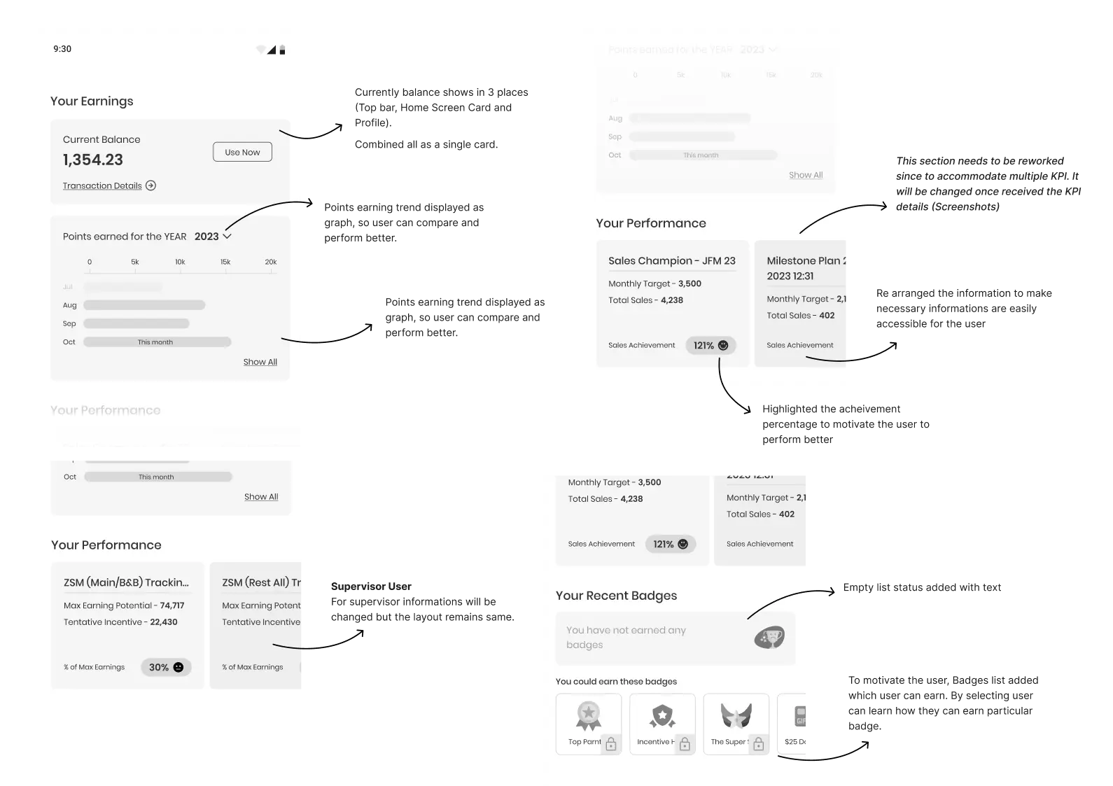
Old UI
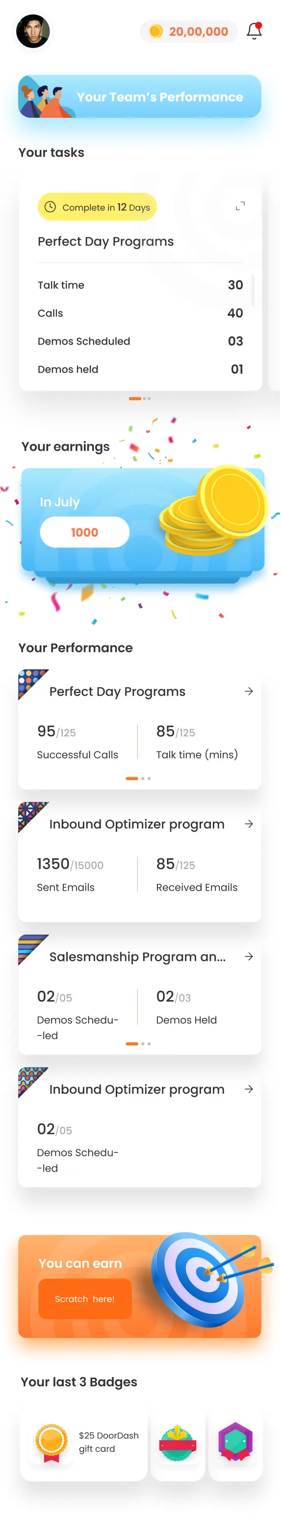

New UI
Old UI
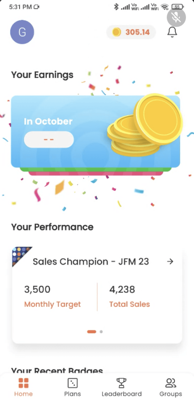


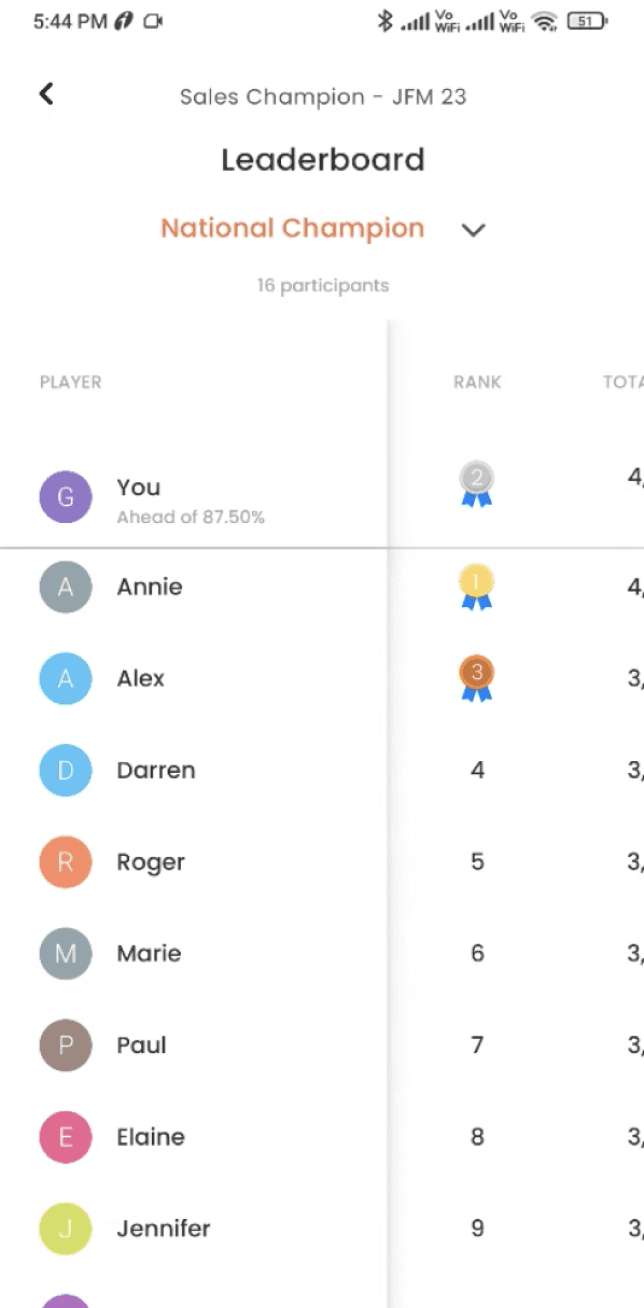
New UI
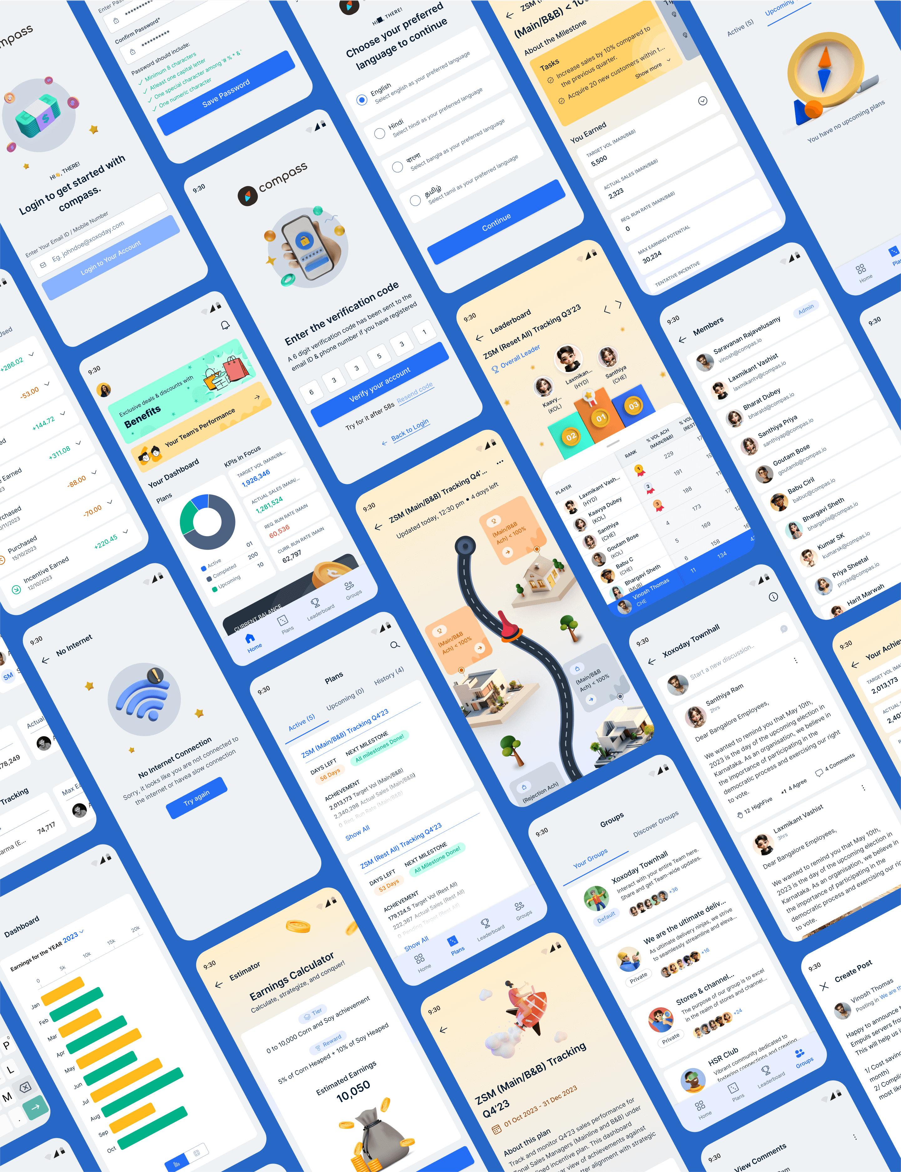
Design Outcomes
The redesigned mobile experience greatly increased user engagement and made tasks clearer. With gamified dashboards, easy navigation, and visually engaging empty states, users could track their progress more easily, complete goals, and stay motivated. The updated UI also matched the client’s design system, "Flames," and created a more consistent brand experience.
Before Redesign
Cluttered dashboards had limited visual hierarchy.
Progress tracking was unengaging.
Empty states were difficult to understand and boring.
Navigating between programs and badges was hard.
There was a disconnect from the brand identity.
After Redesign
Clean layouts improved readability and flow.
Gamified incentives and performance goals came with rewards.
3D illustrations on empty screens boosted engagement.
Navigation was simplified with clearly defined modules.
There was complete integration with the in-house "Flames" design system.