Freshworks
Freshworks - Design System
Building a comprehensive design system from scratch to unify Freshworks' post-rebrand product UI-providing designers and developers with shared guidelines, reusable components, and governance.
Industry
Software as a Service (SaaS)
Average Revenue
$700M (2024)
Total Customers
72K+
Average Page Visits
1.5M / Month

When Scaling Outpaced Standards
Background
As part of the Freshworks rebranding initiative, I was involved from the ground up-helping define the new visual language through the design of landing pages, selection of color palettes, typography, and overall design direction.
The Challenge
As the rebranding project scaled and more designers joined the team, maintaining consistency across deliverables became increasingly difficult. We needed a centralized source of truth to ensure alignment and efficiency.
Taking the Initiative
Recognizing this gap, I proposed the idea of creating a comprehensive Design System-a scalable and evolving guide to enforce consistency and streamline collaboration. This would help both internal and external teams understand and apply the rebranding principles effectively.
Goal
Create a scalable design system to unify product UI post-rebrand. Empower designers and developers with clear guidelines, reusable components, and governance.
Exploration & Tool Evaluation
Initially, I experimented with platforms like Zeroheight and InVision DSM to build and host the system. However, these tools had limitations in flexibility and customization, which prompted a shift towards building an internal design system platform tailored to Freshworks' needs.


Execution
Defined foundational elements: color palette, typography, iconography, spacing, grid systems, and UI components. Collaborated with product and front-end teams to ensure implementation feasibility. Documented usage guidelines, accessibility considerations, and interaction patterns. Led a team of designers to populate the system with real-use components and templates.
Impact
Enabled faster onboarding for new designers and developers. Significantly reduced design inconsistencies across pages and products. Improved design-to-development handoff with standardized components and tokens. Established a scalable foundation for future product and marketing design efforts.
Building the Design System
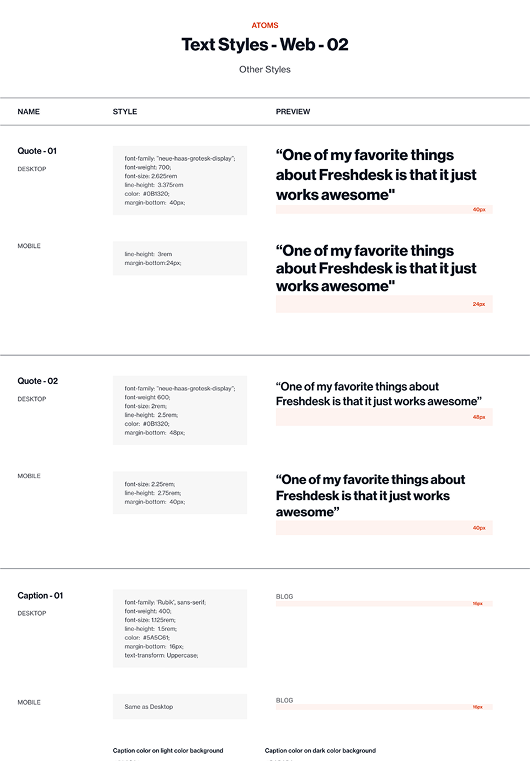
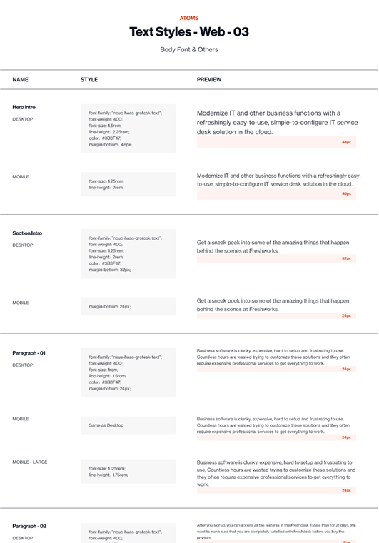
Type Scale: Rigorous Foundations for Visual Harmony
To ensure balanced typography, I evaluated multiple scaling methods: tested modular scale ratios (1.125, 1.25) for proportional hierarchy, explored fluid typography for responsiveness but prioritized consistency, and adopted IBM's Carbon Design System formula (base-10, logarithmic progression) for its proven scalability and developer-friendly math.
Xn = Xn‑1 + {INT[(n‑2)/4] + 1} × 2
Xn: step n type size Xn‑1: step n‑1 type size
Result: A predictable type scale that harmonized with our grid system, reduced arbitrary decisions, and accelerated UI development.
Line Height: Precision-Built for Readability
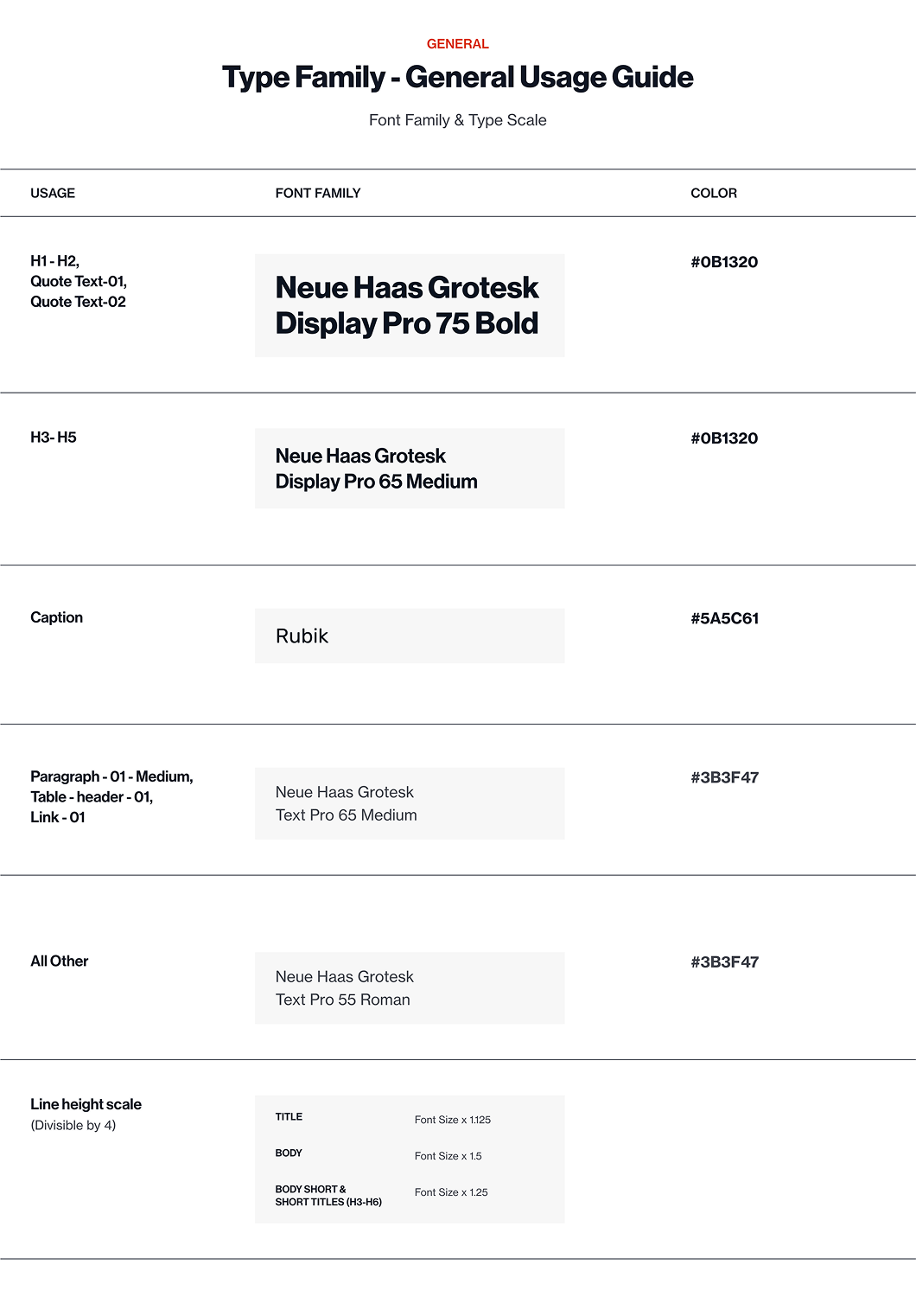
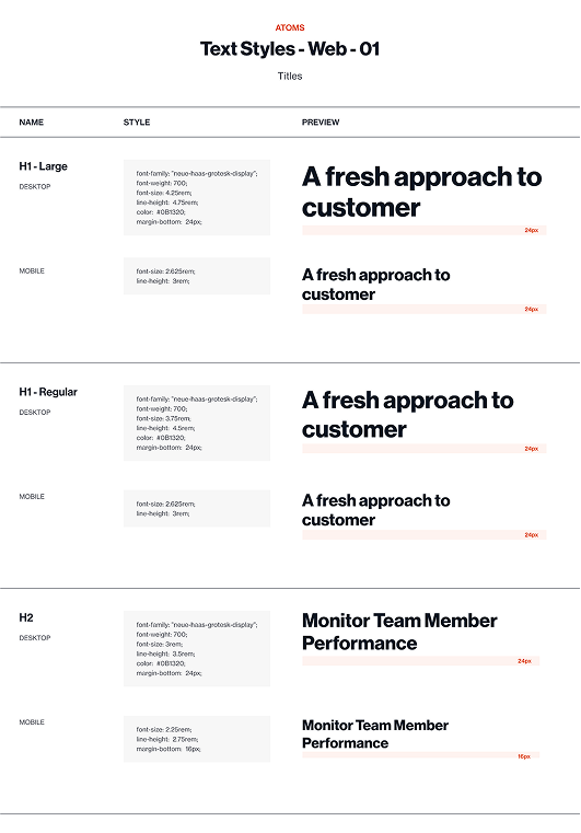
To pair with our type scale, we defined line heights using a multiplier system tailored to each text role: Titles (H1–H2) at 1.125× font size (tight for impact, yet breathable), Body Text at 1.5× (optimal for long-form readability), and Short Text & Subheadings (H3–H6) at 1.25× (balanced density for scannability).
Why it worked: Mathematically harmonious - multipliers aligned with our Carbon-based type scale. Role-specific optimization - no arbitrary values; each ratio served a functional purpose. Developer-friendly - simple rules like line-height = font-size × ratio ensured consistency.
Spacing System: Strict 8-point grid for all vertical and horizontal spacing - consistent multiples of 8 (8/16/24/32px) to align typography, components, and layouts with pixel-perfect precision.
Scroll For More
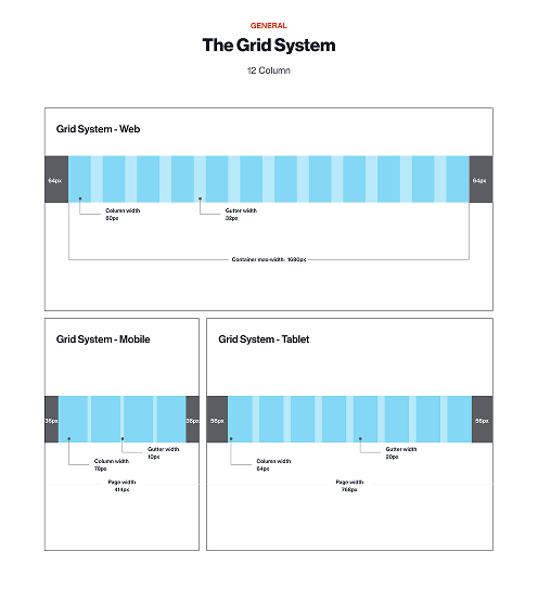
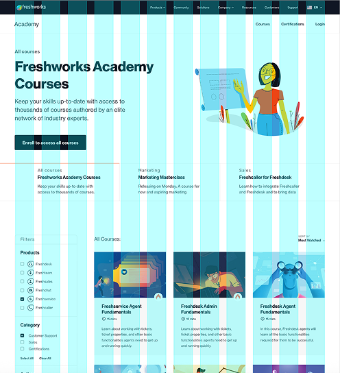
Grid Systems: Precision Across Devices
Desktop: 12-column (80px cols, 32px gutters) for content-rich layouts at 1680px max-width. Tablet: 8-column (64px cols, 20px gutters) optimized for 768px screens. Mobile: 4-column (78px cols, 10px gutters) tailored to 414px viewports. Consistent 64px/56px/36px margins create visual breathing room while maintaining structural harmony across breakpoints.
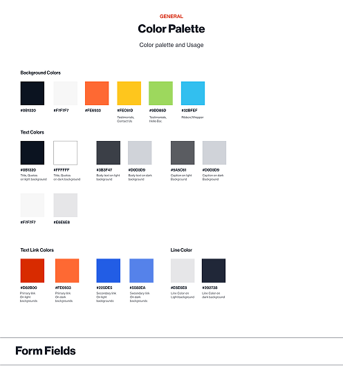
Color Palette: Purpose-Built Hierarchy
Primary (#0B1320, #FE6933): Brand dominance - CTAs and key actions. Text (#383F47, #FFFFFF): Readability-focused, WCAG AA+ compliant. Functional (#D62800, #2251E5): Clear states for errors, links, and focus. Backgrounds (#FEF5F0, #E6EEE8): Subtle contrast for depth. Each color has documented usage rules to eliminate guesswork.
Scroll For More


Atomic Design System: Structured for Scalability
To streamline design and development, we adopted Atomic Design Methodology, breaking UI into a hierarchical system:
Why It Worked
Reusability - Reduced redundancy (e.g., 1 button atom driving 50+ implementations).
Team Alignment- Designers and developers spoke the same “component language.”
Scalability - New features plugged in seamlessly without redesigns.
Let's WorkTogether
I'm open to new opportunities, collaborations, or just a good conversation.